Thought of the Week: Close, Yet So Far

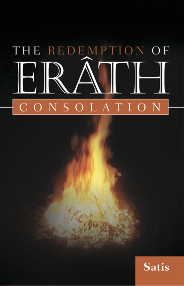
I have some important news for you all this week: The Redemption of Erâth: Consolation is now officially available for sale, in both hard cover, soft cover and Kindle/Nook editions! You can head over here to buy a copy today!

photo
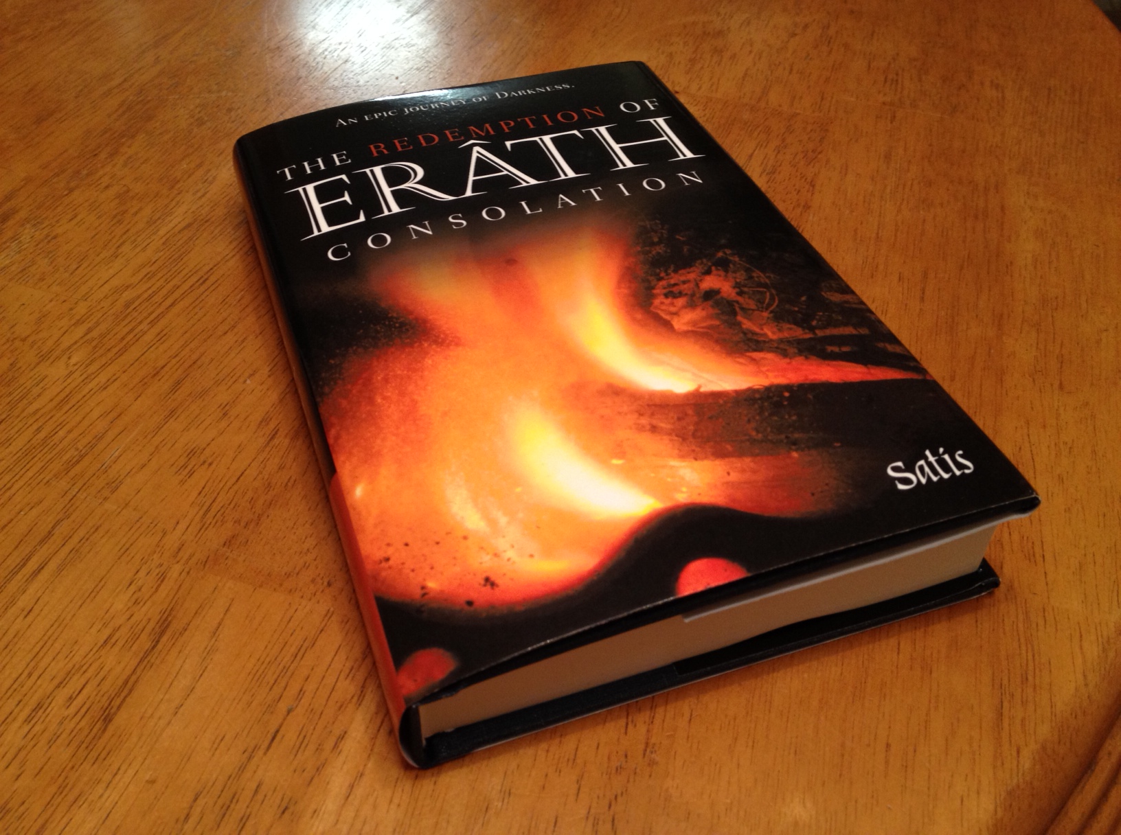
I don’t know if anyone has bought any copies yet; I don’t think I can find out until the end of the quarter. Having said that, I ought to be over the moon with excitement anyway – something I wrote is actually available to buy. I’ve even read through the book in hard cover myself (the single free copy they sent to me). But I’m not.

All of a sudden I’m crippled by a depression deeper than any I’ve known in years. I can’t think, I can’t write, I can hardly get out of bed, and I don’t know how I’m going to go to work tomorrow. My wife says it’s because I went off my medication; I guess she’s probably right, though I didn’t intend to go off them – I just ran out, and the doctor won’t prescribe more until I go to see him, but the depression is stopping me from getting out of the house and making an appointment…ugh.

So I all of a sudden just don’t care. I feel as close to dead inside as I can be without being, you know, dead. I can’t imagine being energetic about anything. I have all of Book 2 to edit, and Book 3 is started, and my other book, A Gothic Symphony, crying out for attention; I have a house to organize and put away and clean after just moving into it, a kid’s bedroom to sort before he comes back from his grandparents, and I can already see it’s not going to get done. I spent eight hours in bed today after waking up. The only thing I could bring myself to do was watch a movie, which is kind of like being in bed, but on the couch.

I’m going to leave this here because it’s all I have the energy to write. Maybe, if you feel like it, download a copy of The Redemption of Erâth: Consolation and have some nice reading time. Otherwise, wish me luck for getting out of bed tomorrow morning for work.

Thought of the Week: Commitment

Hello readers!

Just a short post this week: in the midst of the furore of moving house, I sent back the approval form for the cover for The Redemption of Erâth: Consolation. What does this mean? The book has an official cover!

Screen Shot 2014-07-08 at 12.13.29 PM


This is based on the fire image I supplied to the publishers instead of the image they had used to begin with:

My own roaring fire.


I had actually sent them my own mock-up of the cover, and they essentially replicated it, so in a way, that’s my own design up there! In fairness to them, though, they chose the font, layout, coloring, etc.

It’s funny, because there’s a part of me that feels like I’m rushing into this—that I’m not giving this enough thought. There’s a separate part of me that just wants it done and over with, that just wants to hold the damn book in my hands, and I think it’s this part that won out. I’m terrible with commitment—terrible at making permanent decisions. Yet somehow the decision to go forward with this cover came easily. Without a second thought, I signed the sign-off form and sent it back, only ten minutes ago. The decision is made.

Will I regret it? Who knows. I held a vote at work for two different cover options, and the above cover did not win. Yet when I spoke with people, the best feedback I got was based on the ‘fire’ cover; that it seemed to hold a deeper meaning for the story (the fact the Brandyé’s parents die in a fire, that he learns of the world through his grandfather’s fireside tales, that he ends up branded with the mark of darkness), and a stronger allure, a stronger pull. The other cover (below for comparison) apparently just ‘looked pretty’.

Screen Shot 2014-06-30 at 9.15.03 AM


There’s still a part of me that’s torn; I do like the symbolism of the dark clouds descending over a final sunset, the tree (an important setting in the book) and the fierund’s face peering through the clouds, but there’s something cozy, dark and mysterious about the fire that attracts me, as well.

The good news is this means that the interior and cover of the book are approved (by me—eek!), and it’s just about time to ramp the book into production. I’m not entirely certain what the next step is, but I’m excited to think that soon—soon—I might have an actual release date for the book! Won’t that be something?

Satis Logo 2014

Thought of the Week: Novel Proofs

All right, so I have some big news, everyone – this week I received the proofs for the interior and cover designs of The Redemption of Erâth: Consolation! I was  very excited to see what they looked like, and naturally I wanted to share them with you as soon as possible. I’ve spent some time going over them and thinking about possible improvements, but before I get into too much detail, I’d love to see what you think.

Here is the front cover design for The Redemption of Erâth: Consolation:

The cover for The Redemption of Erâth: Consolation. Fire and Darkness.

The cover for The Redemption of Erâth: Consolation. Fire and Darkness.

And here is the first page:

Screen Shot 2014-06-24 at 5.15.00 PM

Yet more fire. Hm – was this a theme?

So…what do you think?

In all honesty, I think the cover leaves something to be desired. I’m actually pretty happy with the interior; I wasn’t expecting the little graphic flames here and there (they use them as section breaks as well as chapter headers), and while I’m aware they could come across as a little cheesy, personally I think it lends something to the atmosphere of the book.

As for the cover, though…I think it really boils down to two or three things. The first major thing that struck me was the image – it just seems so generic! I don’t disagree with the use of fire as a visual theme; certainly, it features heavily in the book itself (the first section is called Tales by the Fire). But the picture itself looks like a kind of small bonfire, rather than the kind of comforting hearth or stove that features in the book. I have an image of my own that I’d much rather use instead; tell me what you think:

My own roaring fire.

My own roaring fire.

The second thing that struck my was the awful orange color of the text highlights. I understand the choice – it goes with the predominant color in the fire image – but it just looks ghastly. It needs to be much redder and darker. If they used my fire image, of course, it would be easier to match to a darker red…

The final thing was the font. I just don’t know it it really captures the feel of the story. I know that might sound silly, but the heading font is incredibly important to the overall enticement of the story. I had envisaged something slightly more gothic-feeling, a little more flowing:

Font: Marigold Wild

Font: Marigold Wild

I feel a little bit lost; I don’t have a cover designer myself (although I do have the option to submit my own design work), so I’m somewhat reliant on what the publisher comes up with. I’m pretty sure I’m going to ask them to change the color and use my fire image, but I still just don’t know if the cover could be any better. What do you think?