All right, so I have some big news, everyone – this week I received the proofs for the interior and cover designs of The Redemption of Erâth: Consolation! I was very excited to see what they looked like, and naturally I wanted to share them with you as soon as possible. I’ve spent some time going over them and thinking about possible improvements, but before I get into too much detail, I’d love to see what you think.
Here is the front cover design for The Redemption of Erâth: Consolation:
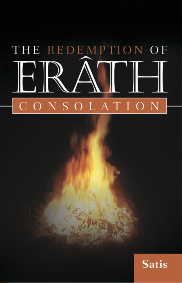
The cover for The Redemption of Erâth: Consolation. Fire and Darkness.
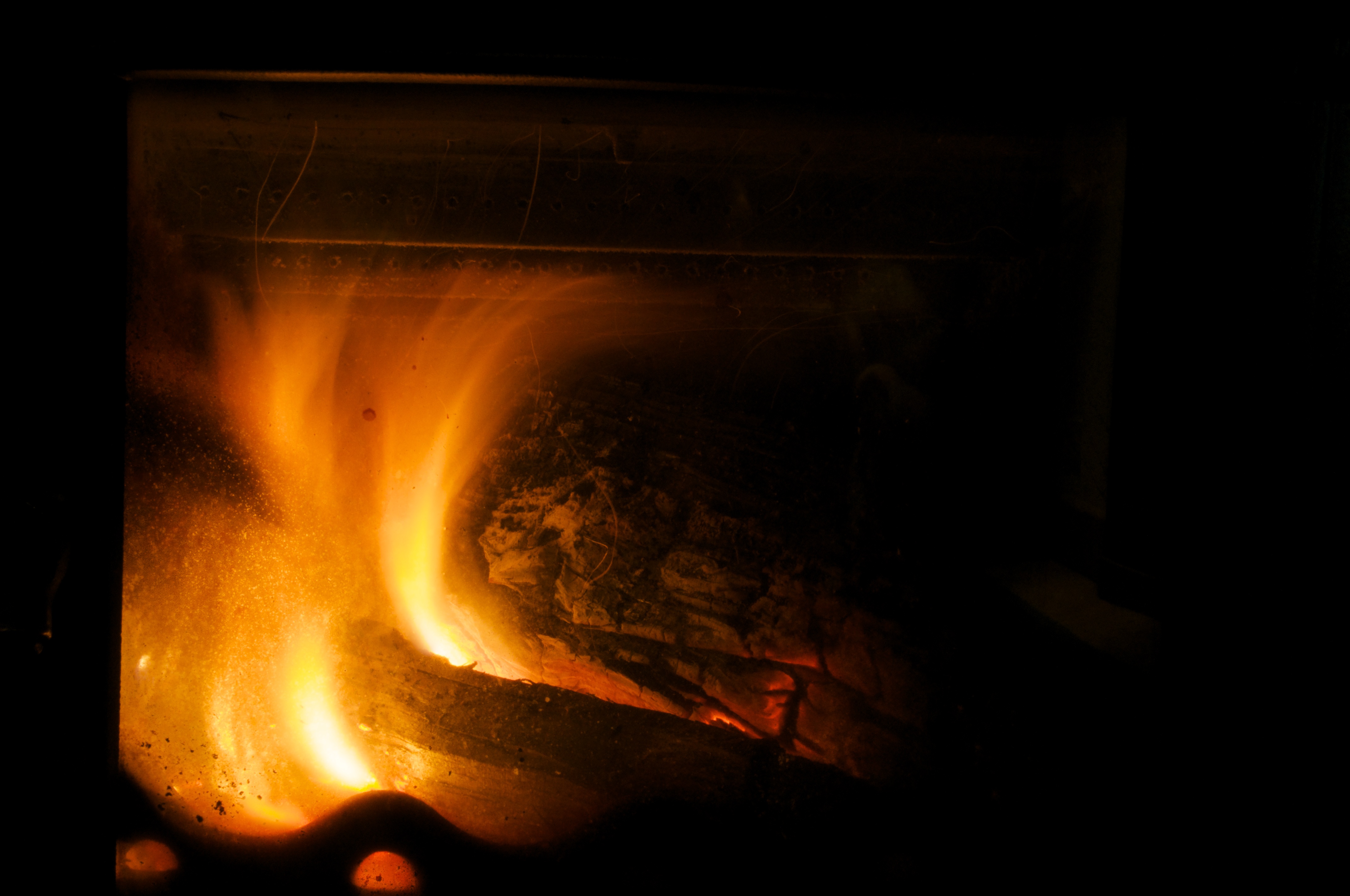
And here is the first page:

Yet more fire. Hm – was this a theme?
So…what do you think?
In all honesty, I think the cover leaves something to be desired. I’m actually pretty happy with the interior; I wasn’t expecting the little graphic flames here and there (they use them as section breaks as well as chapter headers), and while I’m aware they could come across as a little cheesy, personally I think it lends something to the atmosphere of the book.
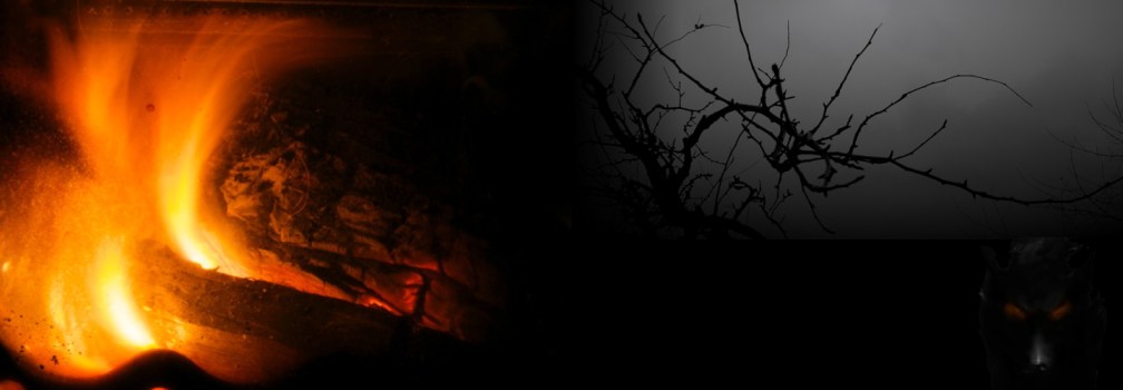
As for the cover, though…I think it really boils down to two or three things. The first major thing that struck me was the image – it just seems so generic! I don’t disagree with the use of fire as a visual theme; certainly, it features heavily in the book itself (the first section is called Tales by the Fire). But the picture itself looks like a kind of small bonfire, rather than the kind of comforting hearth or stove that features in the book. I have an image of my own that I’d much rather use instead; tell me what you think:
My own roaring fire.
The second thing that struck my was the awful orange color of the text highlights. I understand the choice – it goes with the predominant color in the fire image – but it just looks ghastly. It needs to be much redder and darker. If they used my fire image, of course, it would be easier to match to a darker red…
The final thing was the font. I just don’t know it it really captures the feel of the story. I know that might sound silly, but the heading font is incredibly important to the overall enticement of the story. I had envisaged something slightly more gothic-feeling, a little more flowing:
Font: Marigold Wild
I feel a little bit lost; I don’t have a cover designer myself (although I do have the option to submit my own design work), so I’m somewhat reliant on what the publisher comes up with. I’m pretty sure I’m going to ask them to change the color and use my fire image, but I still just don’t know if the cover could be any better. What do you think?